이화동 영광빌딩
Design Director : K
Project Designer : K + H
Scale : 지상 5층
Area : A동 490sqm / B동 785.47spm
Client : 영광재단
Construction : 해성 C&D
Principal use : 오피스, 단독주택
Photo : 노경
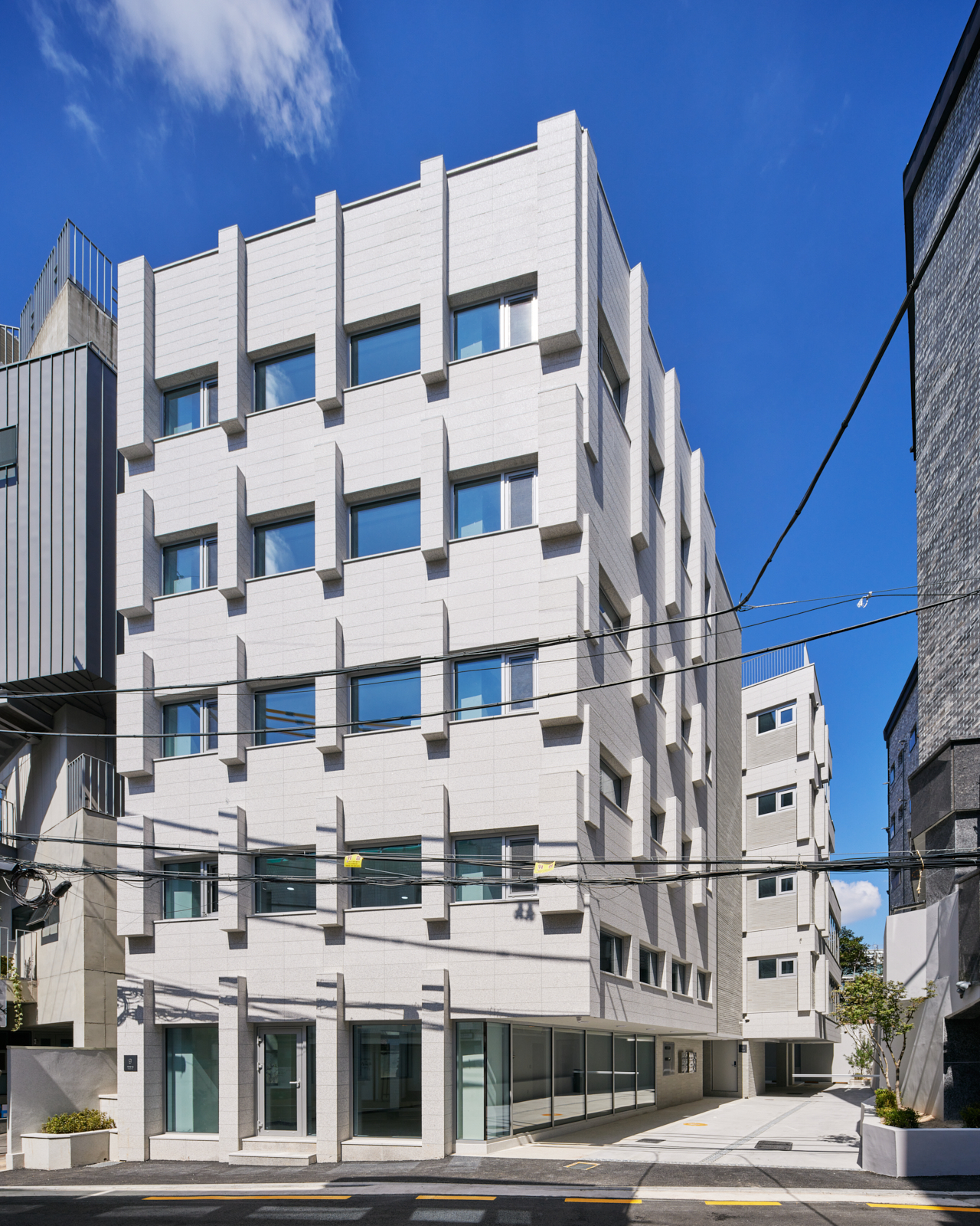
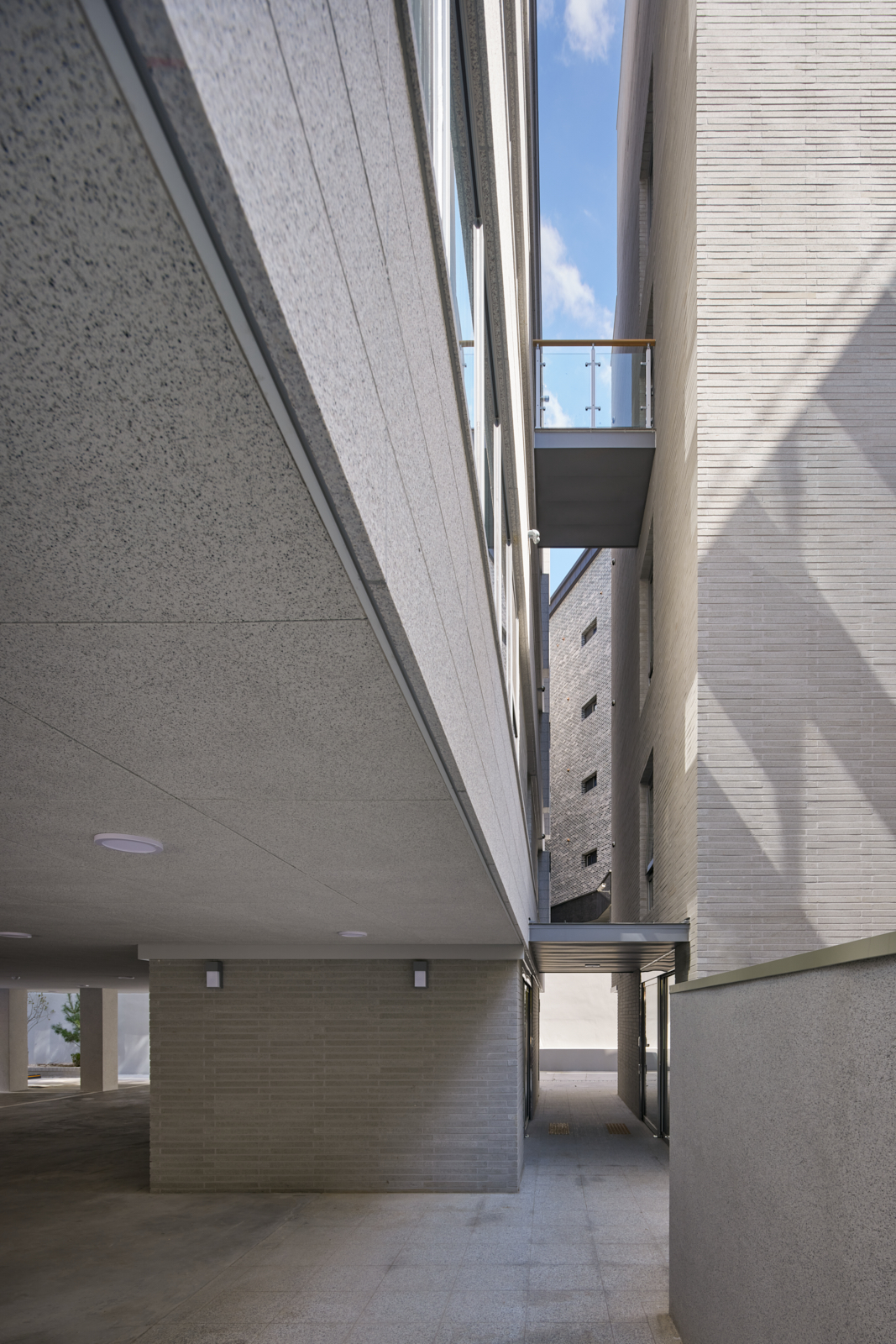
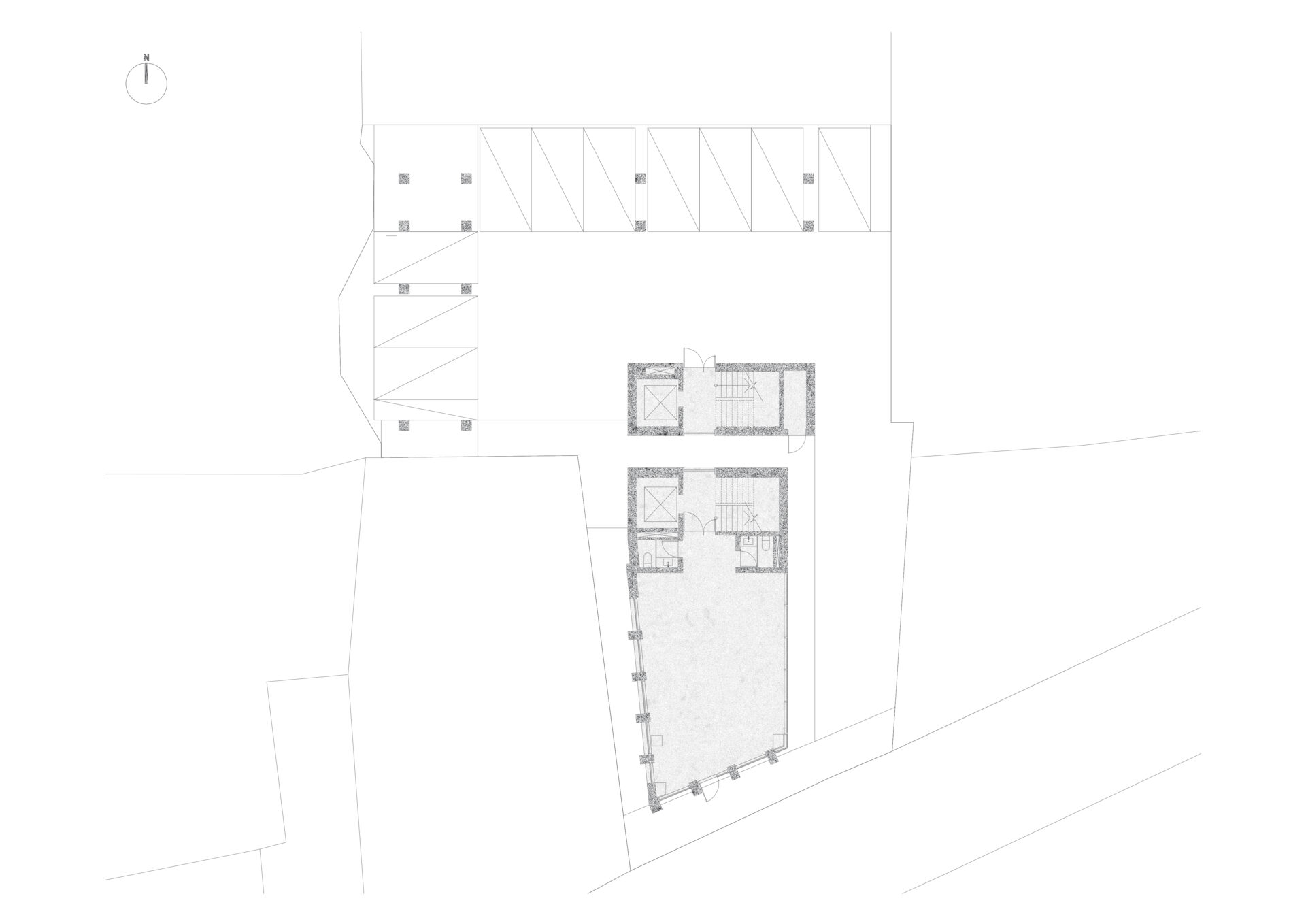
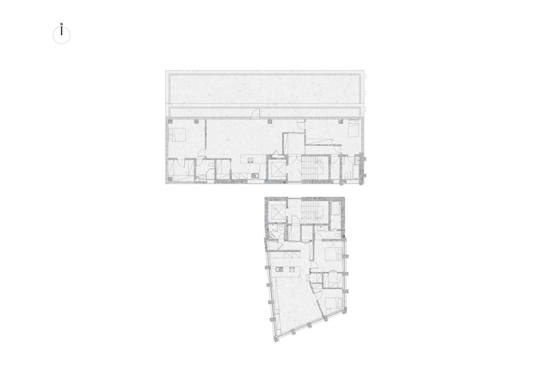
각각 210sqm, 450sqm으로 쪼개진 660sqm의 대지가 도로에 단지 13m 면해 있습니다. 이 두 대지의 합필은 지구단위계획상 최대 개발규모 이상으로 불가했으며, 뒤쪽에 숨겨진 땅은 맹지가 되는 조건을 해결하기 위해 건축협정을 통해 두 필지는 서로 연결된 두 개의 건물로 통합 개발되었습니다.
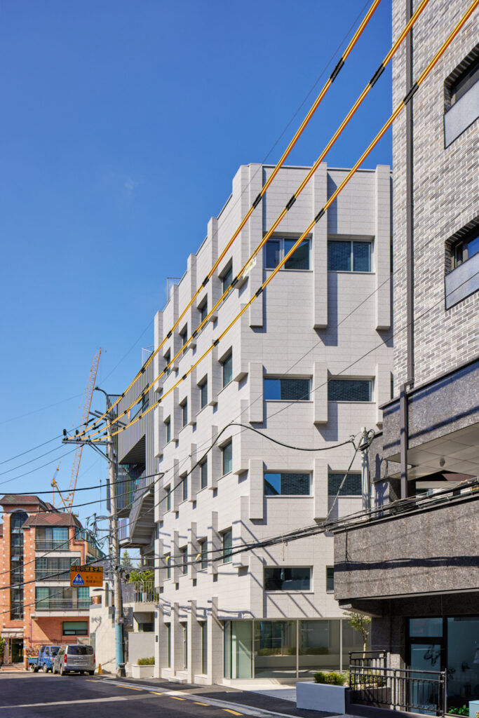
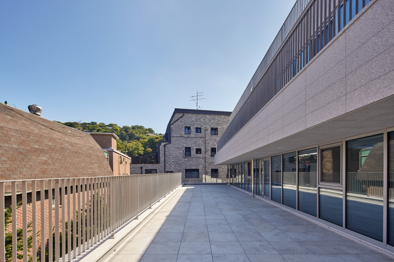
건물 규모는 전체 1,300sqm으로 주변과 비교해서 큰 편이지만, 도로에 노출되는 면적이 너무 적은 탓에 건물의 존재감을 수직적으로, 그리고 중력적으로 강하게 만들어 내려고 했습니다.
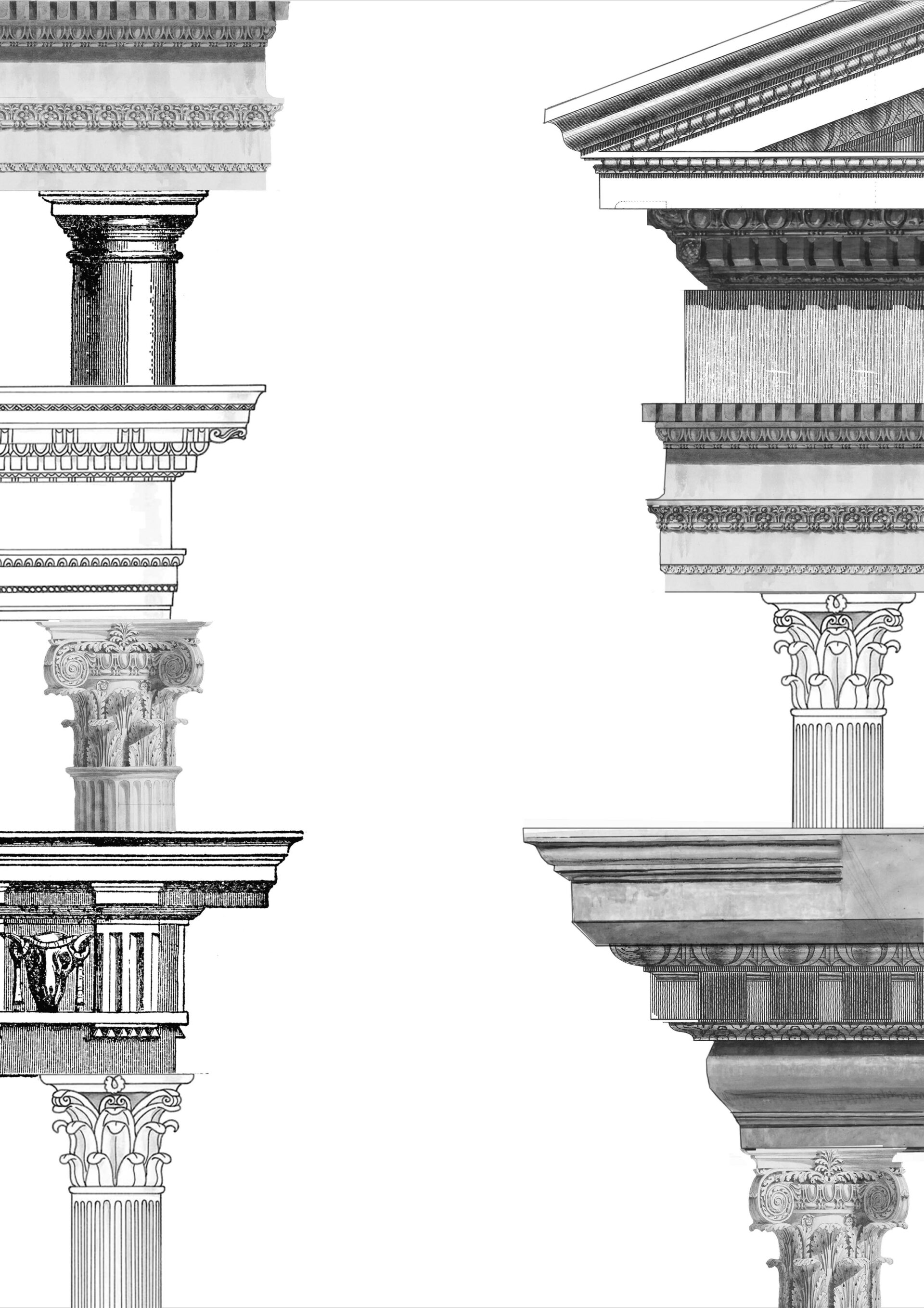
이화동, 동숭동 일대는 외장재로서 벽돌 사용이 권고되는 지역이며, 이는 김수근 선생님의 아르코 미술관과 마로니에 공원이라는 랜드마크가 만들어낸 지역적인 맥락과 관계가 있습니다. 그 이후 많은 건물들이 이 전통을 존중하며 지어졌습니다. 이 지역적인 맥락을 단지 벽돌이라는 재료가 아닌 조적성이라는 더 큰 주제로 확장하려고 했습니다.
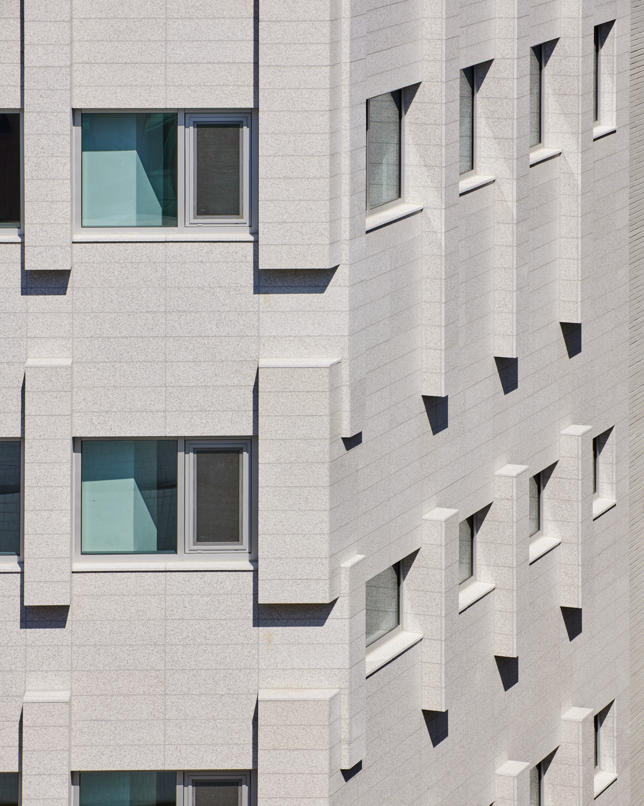
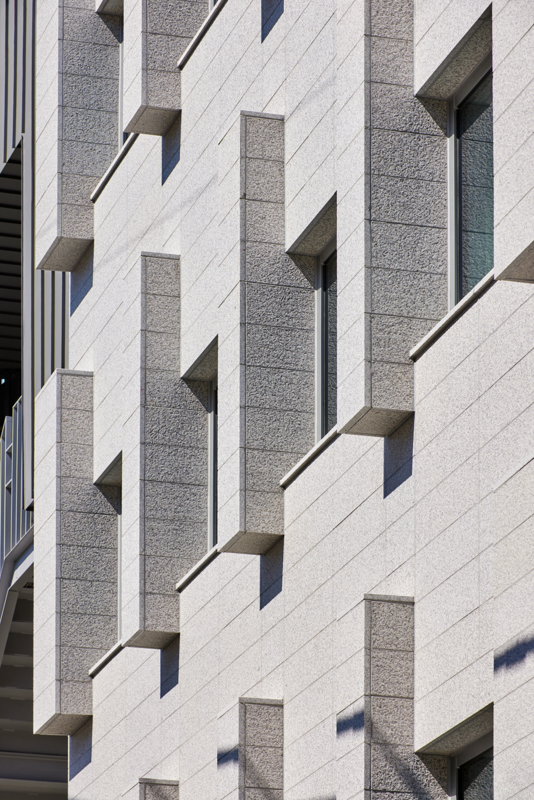
그 주제의식을 분명하게 하기 위해 재료는 벽돌이 아닌 한국에서 가장 일반적인 재료인 포천석으로 만들어졌습니다. 지역성이라는 건축적인 주제는 그 지역에서 나는 제일 보편적인 재료로 일반적인 구축법을 통해서 만들어지는 것이라고 믿고 있습니다.
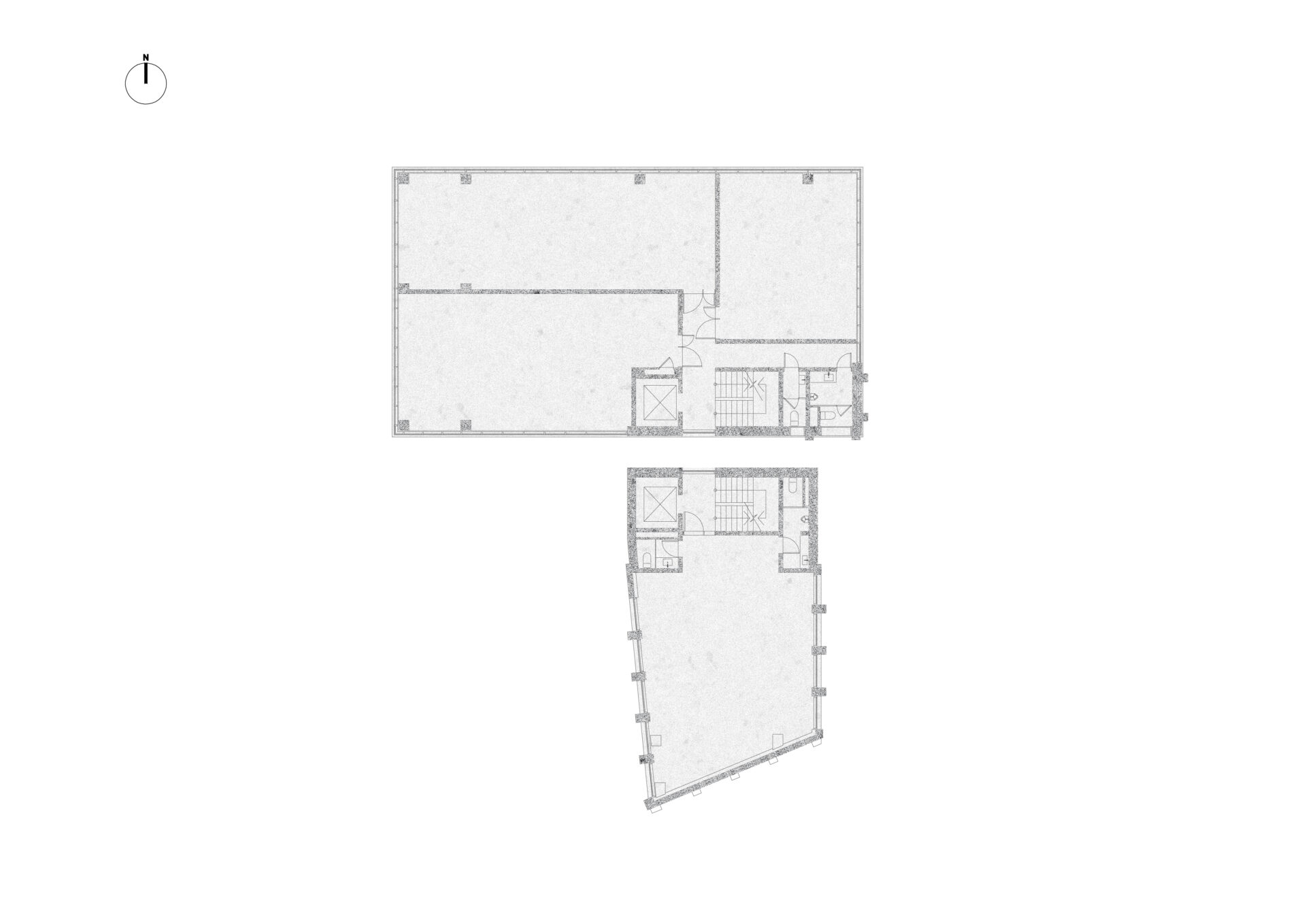
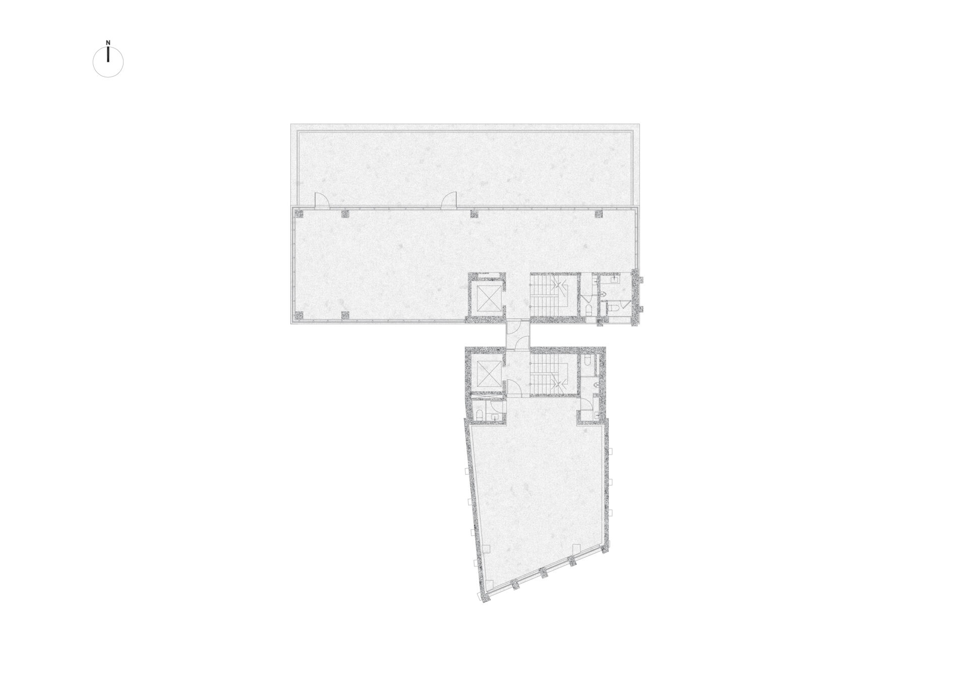
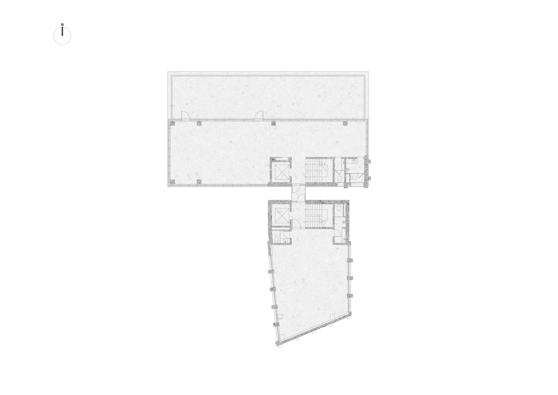
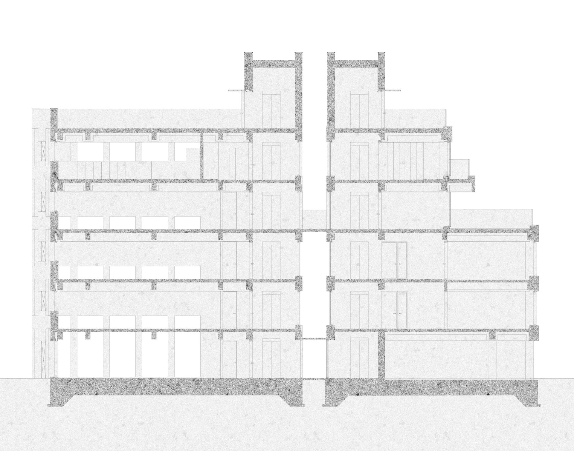
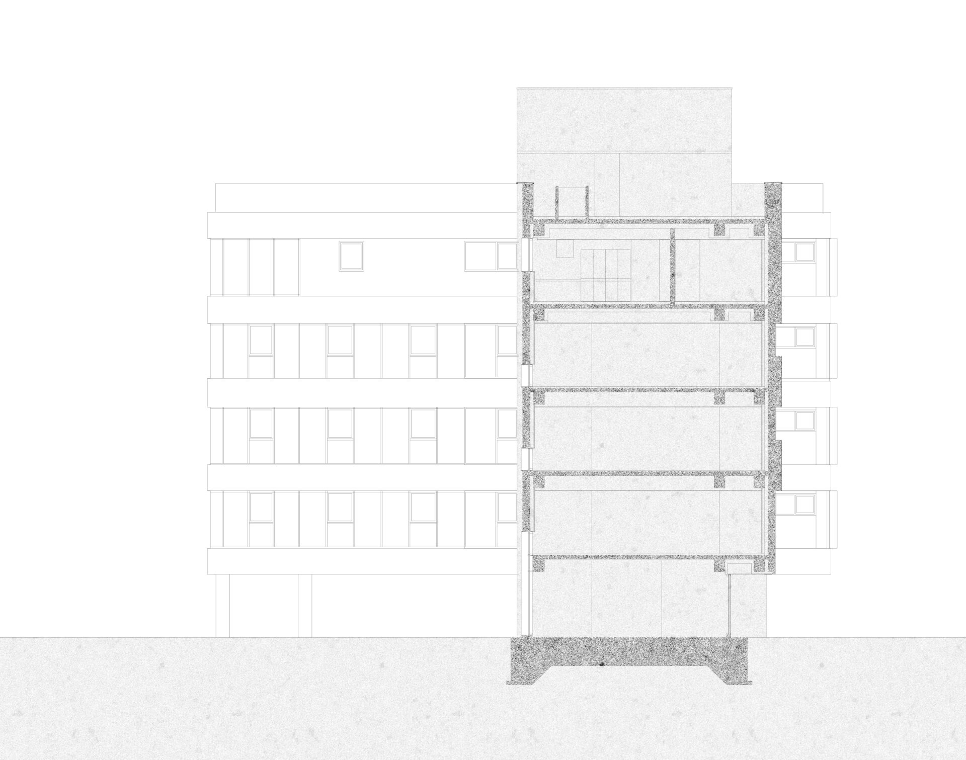
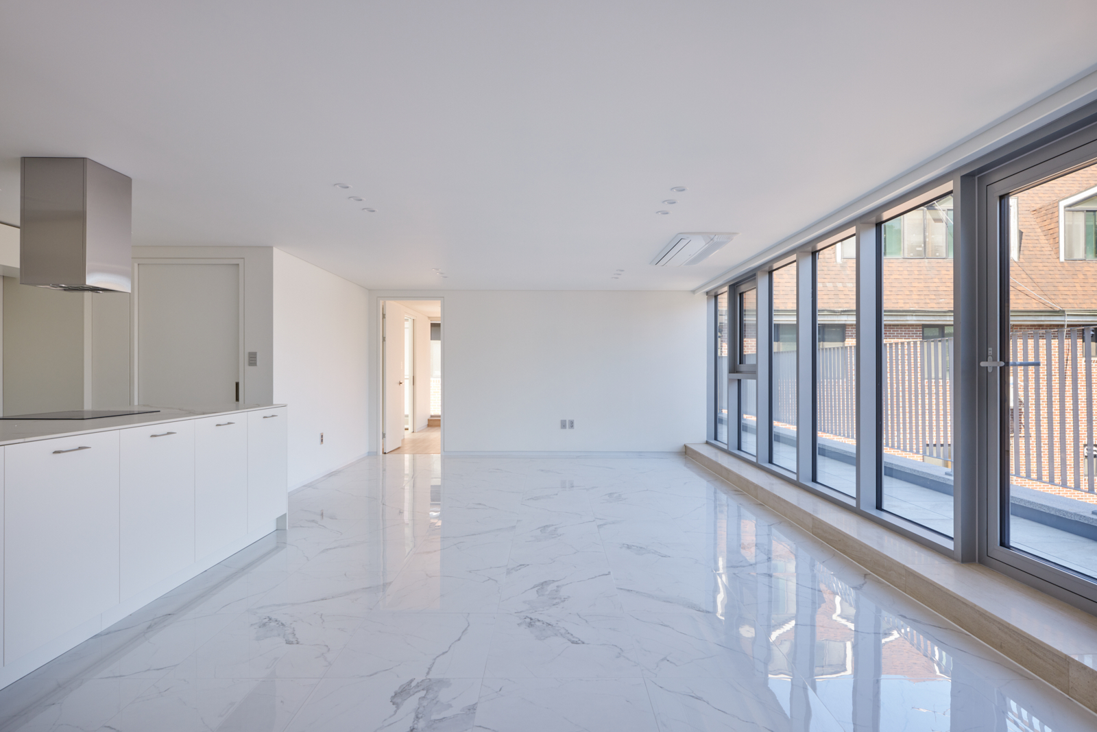
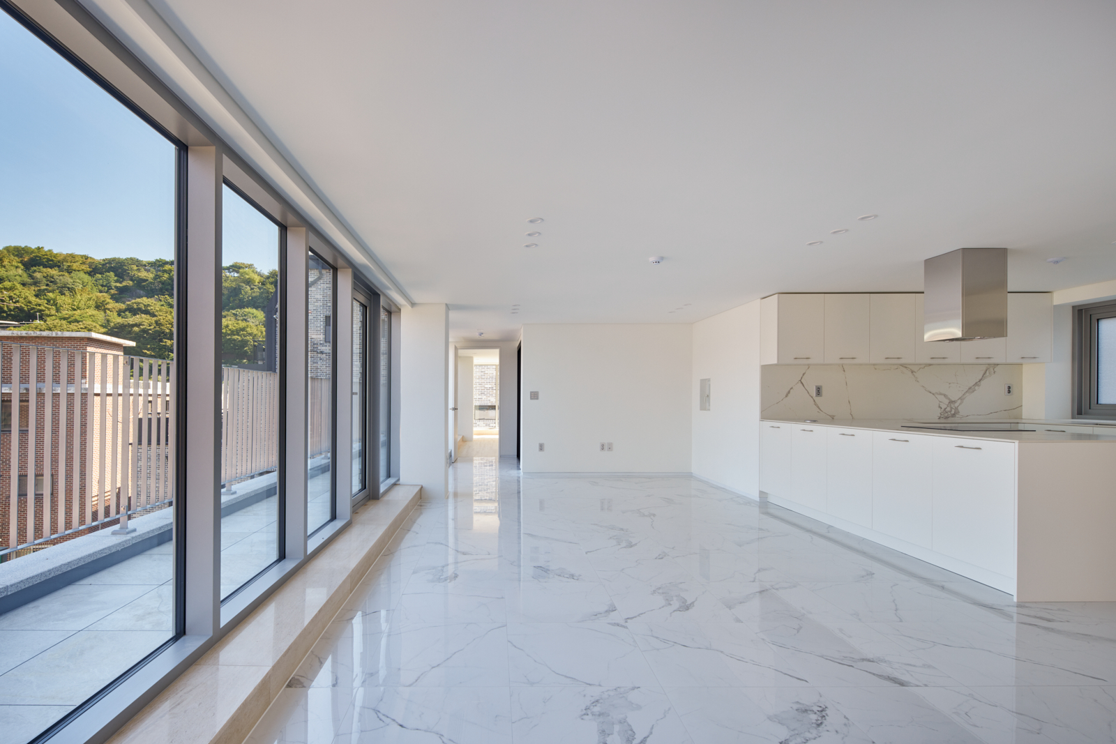
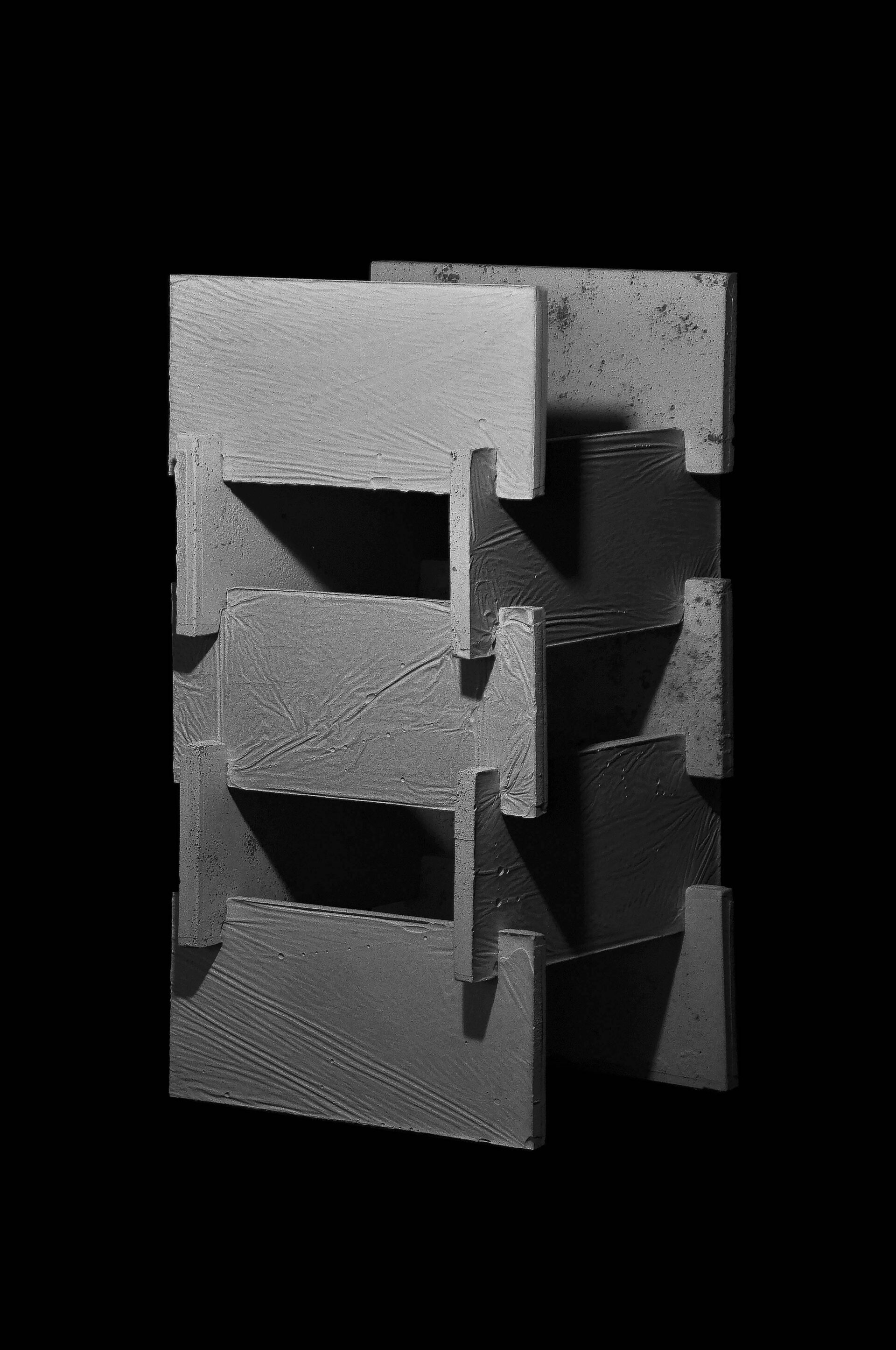
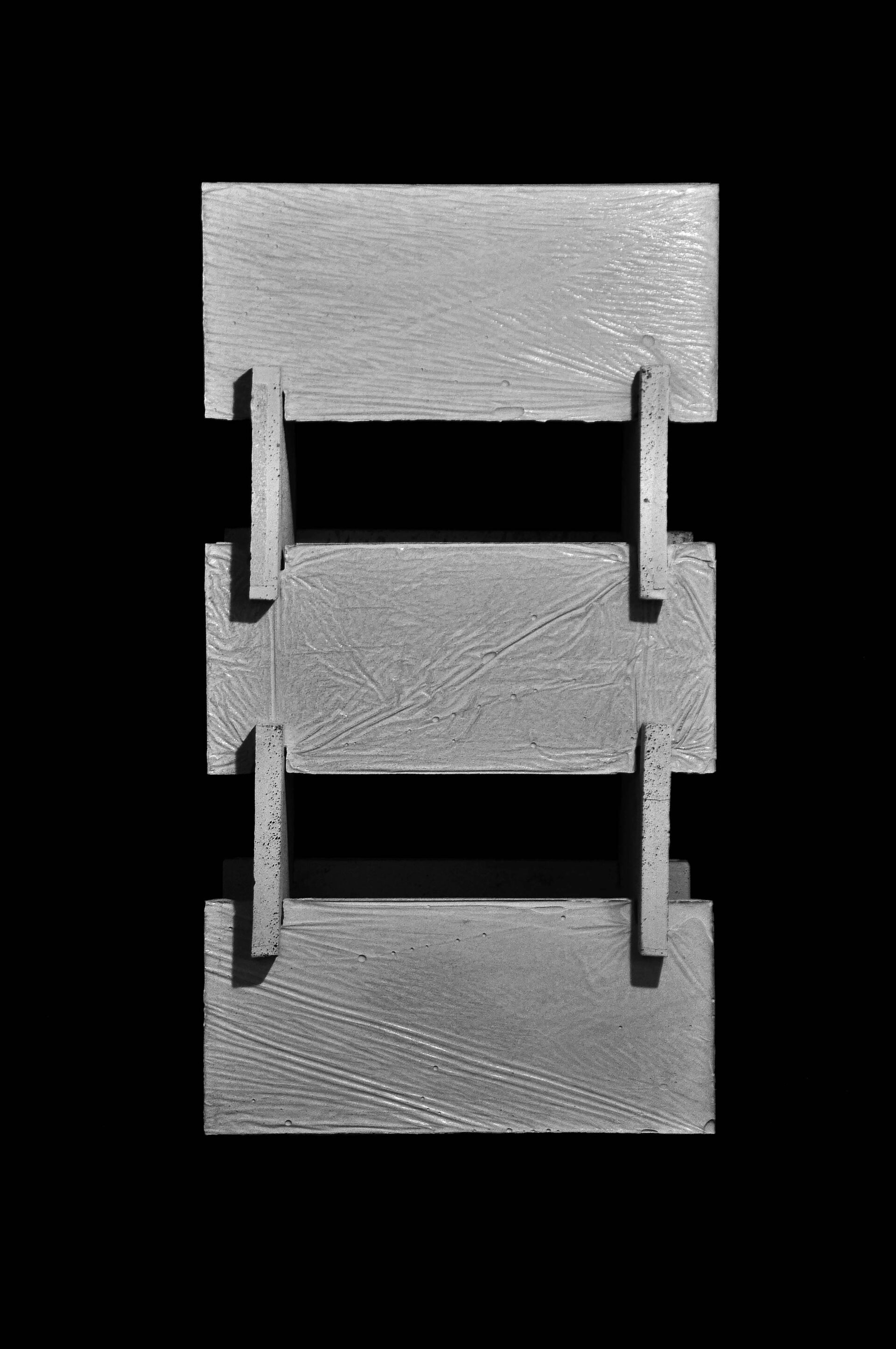
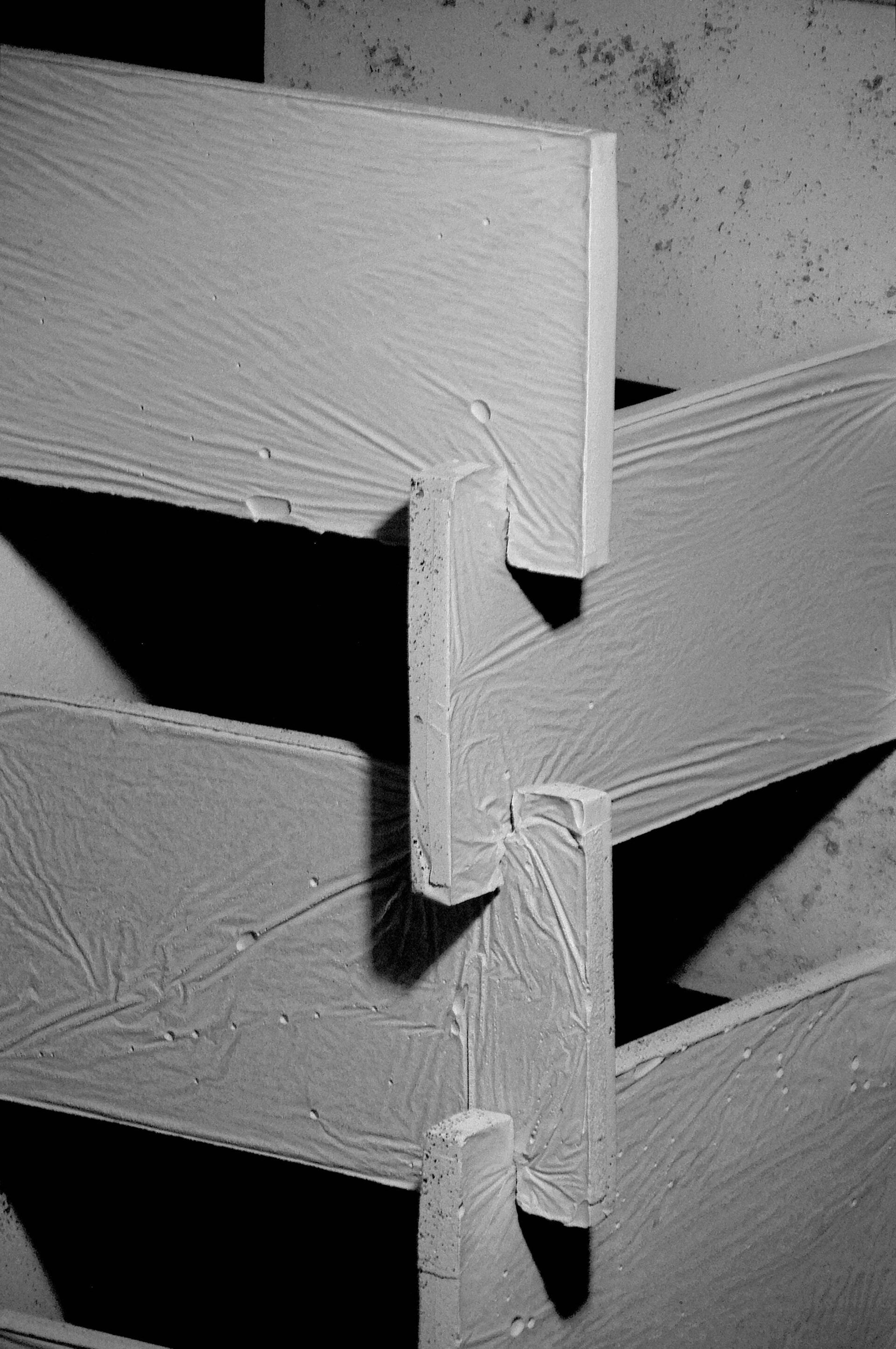
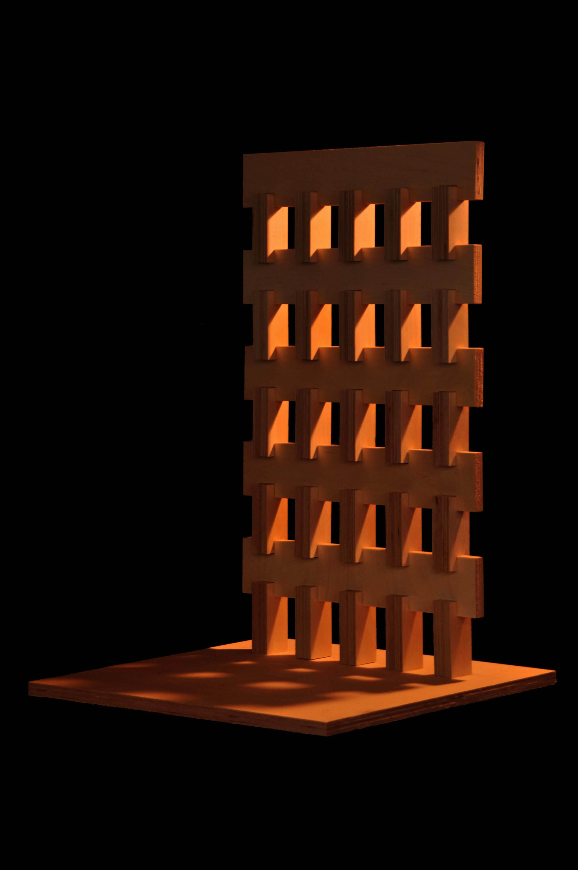
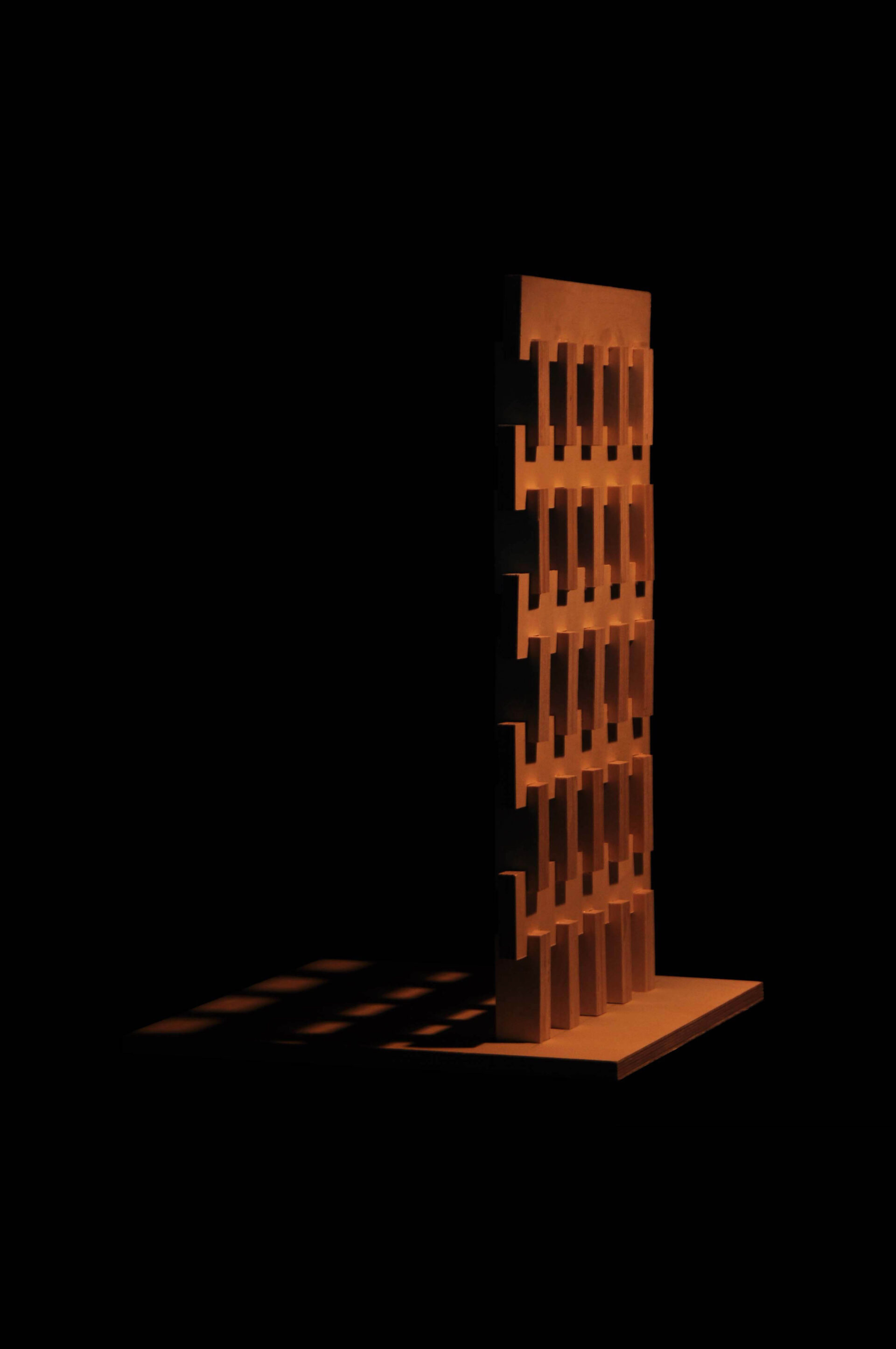
르 코르뷔지에의 가로로 긴 벽은 철근콘크리트라는 재료가 가질 수 있는 가능성을 확장했습니다. 그전의 벽식구조는 그 정도의 인장력을 견딜 수 없었습니다. 철근콘크리트 공법은 여전히 국내에서 제일 보편화된 공법입니다. 이 철근콘크리트의 인장력은 조적되었고, 그 접합부는 목구조처럼 결부되어 있습니다. 가로로 긴 벽은 건물의 수평성을 부각시킵니다. 건물의 정면에서는 이 가로로 긴 벽들의 단면이 노출되며, 대비적으로 건물이 수직성이 강하게 드러납니다.
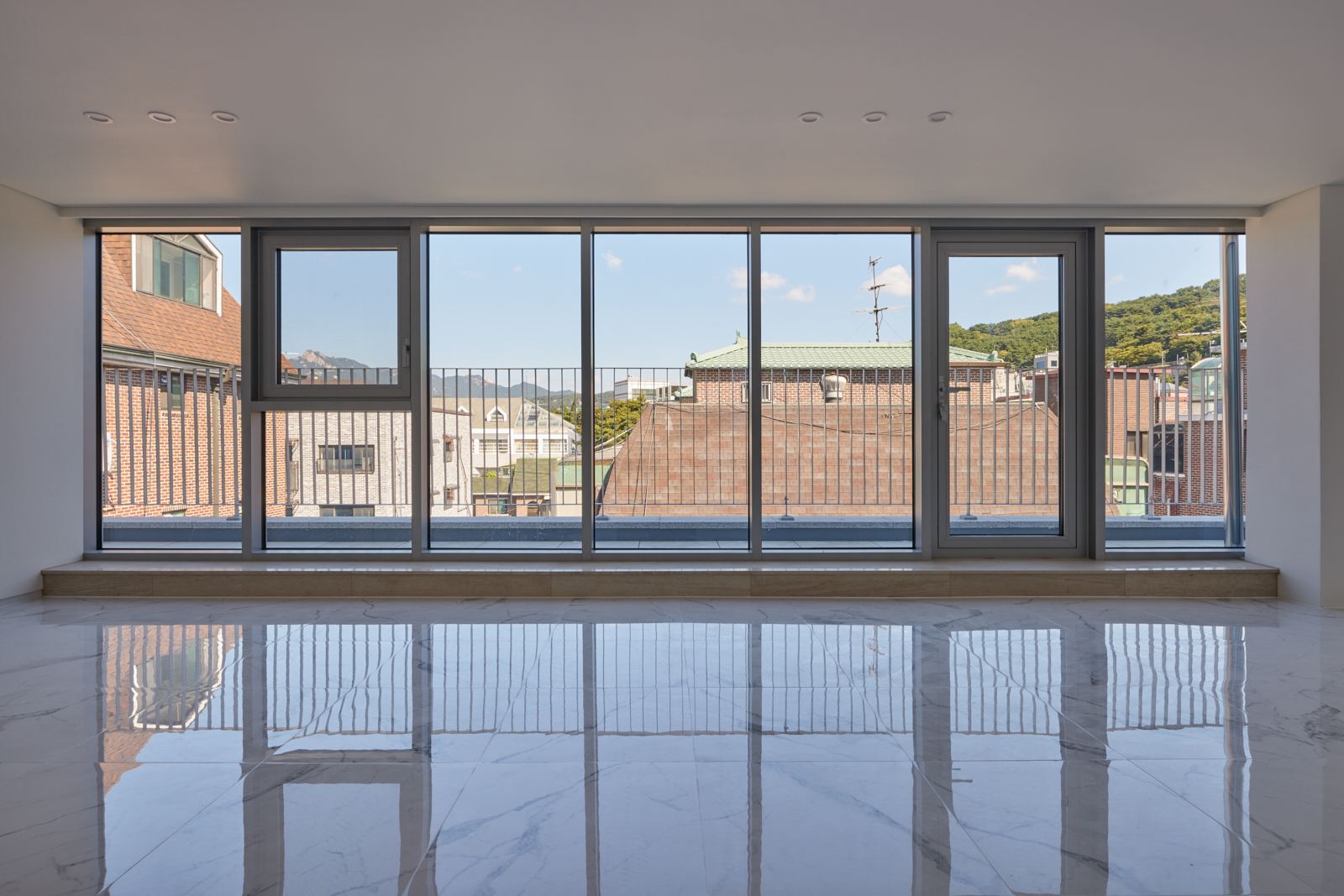
내부의 정면과 측면은 분할되어 전혀 다른 풍경을 담고 있습니다. 정면의 창에는 하늘이, 측면의 창에는 길이 담깁니다. 정면과 측면은 수직적으로 정확히 대비되는 개구부를 가지고 있습니다. 빛과 풍경은 서로 수직적으로 위치가 다른 이 세 개의 면을 통해 매시간, 매번 다른 위치에 공간과 풍경을 달리합니다. 건물의 구축-표현적인 명쾌함과는 다르게, 공간은 풍부하게 변화됩니다.
The land of 660sqm, divided into 210sqm and 450sqm respectively, faces the road just 13m. The combination of these two sites was impossible due to the maximum development scale regulation according to the district unit plan, and to solve the condition that the land hidden in the back became a blind spot, the two sites were integrated and developed into two buildings connected each other.
The total size of the building is 1,300sqm, which is large compared to the surrounding area, but since the visual area exposed to the road is too small, we tried to make the building’s presence strong vertically and gravitationally.
Ihwa-dong and Dongsung-dong regions are areas where bricks are recommended from regulation for exterior materials, and this is related to the regional context created by Kim Soo-geun’s Arko Art Museum and Marronnier Park. Since then, many buildings have been built in honor of this tradition. We tried to expand this local context to a larger theme of masonry, not just a material of brick. To make the subject matter obvious, the material is not made of brick, but Pocheonseok, the most common material in Korea.
Le Corbusier’s Horizontal window expanded the possibilities of a material called reinforced concrete. The wall structures before that could not withstand that kind of tensile force. The reinforced concrete is still the most common construction method in Korea. The tensile force of this reinforced concrete is stacked, and the joint is connected like a wooden structure. Long horizontal walls emphasize the horizontality of the building. The cross section of these horizontally long walls is exposed from the front of the building, and the verticality of the building is strongly exposed in contrast.
The front and sides of the inside are divided, creating a completely different landscape from inside. The front window contains the sky, and the side window contains the road. The front and sides have perfectly contrasting openings vertically. The light and the landscape change the space at different locations every hour and every time through these three faces that are vertically different from each other. Contrary to the construction of the structural – expressive clarity, the space is richly changed.